December 16, 2014

English versus Chinese color descriptors

Raj J Salecha
shared this article with you from Inoreader

Color study

Color exists on a continuous spectrum, but we bin them with names and descriptions that reflect perception and sometimes culture. We saw this with gender a while back. Wikipedia has a short description on culture differences and color naming.

Muyueh Lee looked at this binning through the lens of English versus Chinese color naming. More specifically, he looked at Chinese color names on Wikipedia and compared them against English color names. This comes with its own sampling biases because of higher Wikipedia usage for English speakers, but when you divide by color categories, it's a different story.

Full scrolling explainer here. Fun.

Tags: , ,

Inoreader is a light and fast RSS Reader. Follow us on Twitter and Facebook.

September 03, 2014

Inoreader - Segregated schools, still

New article from your Flowcharts rule in Inoreader
Via FlowingData by Nathan Yau

data.com/2014/09/03/segregated-schools-still/">data.com/wp-content/uploads/2014/08/Share-of-white-kids-attending-majority-white-schools-625x407.png" alt="Share of white kids attending majority-white schools">

The map above by MetroTrends shows the percent of white kids who attended majority-white schools during the 2011-12 school year. Schools are still segregated in many areas of the country.

From Reed Jordan for MetroTrends:

The separation of races is most clearly seen in large metropolitan counties that hold the bulk of a state's population and most of its students of color. For example, in Chicago (Cook County), the overall student population is about 25 percent white, 31 percent black, and 37 percent Latino, but 96 percent of black students attend majority non-white schools and 67 percent of white students attend majority white schools. In other words, white students tend to attend schools with other white students and black and Latino students attend schools with other students of color.

Estimates are from the National Center for Education Statistics. [via @datatelling">datatelling]

Tags: data.com/tag/education/" rel="tag">education, data.com/tag/ethnicity/" rel="tag">ethnicity, data.com/tag/metrotrends/" rel="tag">MetroTrends

Inoreader is a light and fast RSS Reader. Follow us on Twitter and Facebook
You have matches for "map", "data"

August 26, 2014

Face tracking coupled with projection mapping

Via FlowingData by Nathan Yau
Projection mapping — the use of projected images onto physical objects to turn them into something else — continues to grow more impressive. Nobumichi Asai and team combined it with face tracking to completely change a person's face to someone and something else.

Slightly creepy. Supe

August 22, 2014

Introvert'€™s heart mapped

Introvert's heart mapped
Via FlowingData by Nathan Yau
Introvert's heart

August 21, 2014

Mapping plastic in the ocean

Via FlowingData by Nathan Yau
In research efforts to understand marine debris, Andres Cozar Cabañas et al recently published findings on plastic debris in the open ocean. National Geographic and geographer Jamie Hawk mapped the data.
Extent of ocean plastic

Track your sleep with Sense

Via FlowingData by Nathan Yau
Sense
Entering the market of self-surveillance for sleep, via Kickstarter, Sense promises to be a smarter tracker that you don't have to wear.

It's a two-part system. The first part is a sphere that logs your surroundings such as noise and temperature. It sits on your dresser. The second part is the "Sense Pill" which clips on your pillow case to record movement. Data syncs to your phone. And if you have a second person in your bed, you can just get another pill to record sleep on that side too.

Looks promising. They're well over their goal, but if you want to get one as an early backer and at a discounted price, there's one day left in the Kickstarter.
Tags: ,

Feltron Annual Report 2013

Via FlowingData by Nathan Yau
Feltron annual report
In his ninth edition of the personal report, Nicholas Felton looks at communication through his phone, email, Facebook, and physical mail.
Also, don't miss the short video from the New York Times. Felton is half-jokingly asked if he's obsessive compulsive which always amuses me.
It reminds me of when I asked someone about her pedometer, and she gladly talked about how she logged her steps every day for nearly a decade. Days with a lot of steps reminded her of trips or long walks. So naturally, I brought up my dissertation work on personal data collection. I thought she would be totally into it, but she was skeptical. She wondered why anyone would want to collect data on their location, computer usage, or sleep habits. And again, this was right after she told me about her decade of step logs.
There's a disconnect.
Actively looking at your data seems to cross you over to the obsessive side. I haven't quite figured it out yet, but the separation between the active and passive seems to be getting fuzzier. Maybe one day there'll be a guy in an interview who doesn't collect data about himself, and everyone is curious why.
Tags: ,

August 20, 2014

When the world sleeps


Via FlowingData by Nathan Yau
Jawbone Sleep
An additional hour of sleep can make a huge difference in how you feel the next day (especially when you have kids). It's the ability to concentrate for long periods of time versus the ability to stare at a clock until your next break. I got the Jawbone UP24 band to try to improve on that, and I still wear it every night to better understand my sleep habits.
So, it only seems natural for Jawbone to look closer at how people sleep as a whole in a couple of interactive graphics. Select your city to see how people sleep in your neck of the woods.
Every now and then we see a set of graphics that shows America's sleep habits, based on data from the American Time Use Survey. The Jawbone data is likely more accurate though, which makes it more interesting. The former depends on survey participants' memories and doesn't factor out things like reading in bed. The latter is actual sleep.
Tags: ,

Everywhere Jonny Cash went, man

Via FlowingData by Nathan Yau
Everywhere
Johnny Cash says he went to a lot of places in his song, "I've Been Everywhere." Iain Mullan had some fun with the location list for Music Hack Day London and mapped each place as the song plays.
Also related to songs and location: where Ludacris claimed to have hoes.
Tags: ,

August 19, 2014

Watch How Bolivia Built the World's Longest Urban Cable Car System

Via Gizmodo
Watch How Bolivia Built the World's Longest Urban Cable Car System
In most parts of the world, cable cars are relegated to ski areas or amusement parks. But in South America, cities use the gondolas to navigate undulating terrain as public transportation. This fall, two more lines will open in Bolivia's La Paz-El Alto network, making it the longest urban cable car system in the world.
Read more...

Crisis Text Line releases trends and data

Crisis Trends
Crisis Text Line is a service that troubled teens can use to find help with suicidal thoughts, depression, anxiety, and other issues via text messaging. The long-term hope was to anonymize and encode these text messages so that researchers and policy-makers could better understand something typically kept private to the individuals.
Following through, the organization recently released a look into their data and a sample of encoded messages. (There's a link to download the data at the bottom of the page.)
The visual part of the release shows when text messages typically come in, and you can subset by issue, state, and days. It could use some work, but it's a good start. Hopefully they keep working on it and release more data as the set grows. It could potentially do a lot of good.
Tags:

August 18, 2014

Talking Ferguson on Twitter and localness

Via FlowingData by Nathan Yau
Ferguson tweets
For a lot of trending topics, Twitter likes to show an animated map of how a lot of people talked about something at once. They pushed one out for map
Ferguson tweets. Naturally, the map looks a lot like population density. Instead, mapping-ferguson-tweets-or-more-maps.html"Eric Huntley aggregated and normalized for a more useful view.
Ultimately, despite the centrality of social media to the protests and our ability to come together and reflect on the social problems at the root of Michael Brown's shooting, these maps, and the kind of data used to create them, can't tell us much about the deep-seated issues that have led to the killing of yet another unarmed young black man in our country [5]. And they almost certainly won't change anyone's mind about racism in America. They can, instead, help us to better understand how these events have been reflected on social media, and how even purportedly global news stories are always connected to particular places in specific ways.
You won't find answers to the more important questions on Twitter.
Tags: ,

Explorations of People Movements, From Groups to the Individual

Running
In 2010, I surveyed visual explorations of traffic, and it was all about how cars, planes, trains, and ships moved about their respective landscapes. It was implied that the moving things had people in them, but the focus was mostly on the things themselves. Location data was a byproduct of the need of vehicles to get from point A to point B in the most efficient way possible.
Airplanes floated across the sky. Cabs left ghostly trails in the city. The visualization projects were, and still are, impressive.
However, around the same time, it was growing more common for people to carry phones with GPS capability and these days, it's commonplace in areas where most people use smartphones. This new data source gave rise to similar but different visualization projects that were more granular.
We see people. Movements.

Aggregated estimates

Let's not get ahead of ourselves though. Data for people movements has been around for a while. It's just that it came as aggregated estimates — and other forms of course, as you go back further. I mean, the ever so popular Minard chart of Napoleon's March shows people moving.
During this century though, way back in 2007 (a whole six years ago) I played with some global migration data, and that was only on the country level. It also didn't include all the countries in their entirety if I remember correctly.
Getting more local and recent, Jon Bruner used data from the Internal Revenue Service to show migration in the United States, at the county level. Red lines represent a net migration leaving the selected county, and black lines represent arrivals.
Where Americans are moving
Bruner followed up the next year with a more refined version. The map seemed to re-spark interest in migration in other places, such as Carlo Zapponi's peoplemovin project, which still used lines connecting regions but went sans map.
Moving to the USA
WNYC's The Brian Lehrer Show asked listeners who moved to or from New York about where they came from or where they went and then posted the data so that people could play around with it. Interesting projects came out of that little experiment.
Even earlier this year, Hyperakt and Ekene Ijeoma visualized refugee data that goes back to 1975.
Refugee project
So there's a lot of data that shows how people move, but until recent years, it's been typically in aggregate and only reveals endpoints.

Single points from a lot of people

Like I said though, GPS in phones brought a different type of data. And it wasn't just directions to a place that remained isolated in your car. People check-in to places — restaurants, stores, airports — and they share it with others. Many keep their location data public.
Instead of aggregated estimates, you can infer the movement of individuals, through individual check-ins. For example, Foursquare looked at transportation over a year via people who checked in at airports, railway stations, and highways.
foursquare travels
And there are plenty of Foursquare-related maps that let readers make their own inferences. Given enough people with smartphones who use the service, you can see where those people go. The now defunct Weeplaces was a fun interactive that let you explore your check-in data.
This single point check-in data eventually found itself on other services, such as Facebook, Twitter, and Flickr, attached to status updates, tweets, and photos. Location was often implied with these objects, but it soon transitioned to latitude and longitude coordinates.
Anonymous and separate, the data points aren't always immediately informative. See them all at once? You often see obvious patterns. This drove many of Eric Fischer's maps. Zoom in enough and his maps just look like a bunch of dots, and zoom out there's an activity of the masses.
For example, Fischer looked at where tourists and locals go in major cities, based on geotagged Flickr photos.
Tourists pictures in San Francisco
The map looks like a lot of connecting lines in the view above. They're actually a bunch of dots that are close enough together that the streets in San Francisco grow apparent. Blue dots represent locals whereas red dots represent tourists. (It looks like there's a dichotomy between locals and tourists, but the red dots got precedence in this map, overlaid on top of the blue. Still, it's an interesting contrast.)
Fischer followed up the next year with a contrast between geotagged Flickr photos and tweets on Twitter. He called the series See Something or Say Something, and the idea was that people photograph areas with notable things whereas tweets are more everyday. He provided country-level views, but the zoomed in city-level views were far more interesting.
The granular data shows details that the aggregates obscure. That's what's so interesting. And it was just the beginning. More continuous tracking and the idea of phones as sensors were building momentum too.

Many points from a few people

Not surprisingly, continuous tracking seemed to first gain wider adoption in sports. Athletes want to improve their performance, so if there's a more concrete way to see what makes them better and by how much, then all the better. However, the technology can be expensive. Other times it was rough around the edges, involving video cameras with manual labor to put together some form of stop motion.
The technology and demand eventually caught up to each other though, which turns out better for everyone who's interested in their movements. Made by Humans, an artistic interpretation of athletes in motion, is one of my favorites.

These days, it's hard not to watch sports without sports analytics entering the picture. It used to be just random sports facts, but now there are sensors everywhere to track basketball players, log serving speed and ball placement in tennis, and survey quarterback passes at a higher accuracy than before.
Tim Duncan movements
Similar things exist for soccer, baseball, golf, and probably ping pong, bowling, and underwater basket weaving.

Many points from a lot of people

Enter the tracking for individuals today. Many apps for movement still focus on sports-like activity: Strava, RunKeeper, MapMyRun, Endomondo, and plenty more. The data is useful for people with the apps, because they can keep track of how far and how fast they walked, ran, or cycled. People can use this information to set goals and to improve their performance. Some just want to be more healthy.
However, just like the check-in maps of single data points, the path data from running and cycling can also be useful when you look at data from many people. For example, with limited access to RunKeeper data, I was able to get a sense of where people run in major cities. Here's a look at running in Washington, D.C.:
Where people run
Like I said, I only had access to some of the RunKeeper data. Strava released a more expansive interactive map that lets you see running and cycling around the world.
Strava cycling map
These apps used to drain your battery, because it took a lot of resources to constantly grab your location for long periods of time. That's why most people only logged their physical activity. It didn't last all day.
A project I was a part of in graduate school, pre-iPhone, tracked location throughout the day. It tried to at least. A separate GPS device connected to the phone via bluetooth, and we carried a second battery pack to replace the drained one midday.
Now you can download an app that uses your phone's built-in GPS. Leave it on all day to run in the background, and sometimes you don't even notice. Why just track running and cycling when you can track your movements all day? The Moves app, the "activity diary for your life" (and recently acquired by Facebook), stays on all day to log your location and estimates steps, calories burned, and your activities. Human is a similar app. They just released a bunch of maps that show activity in major cities.
Human maps
I use OpenPaths, because I like the data model for privacy and selective sharing. Although I have my eye on an actual GPS device that stores the data locally on one of those memory card things instead of the cloud.

Looking ahead

We can log our location all day every day, with little effort. What next? Well, the apps can even go higher granularity with increased sampling rates. Whatever the new phones allow, I guess. More sensors? Sure. Continuous data? Alright.
At some point though I hope that there are more people who care about where their data goes than there are who do not. I hope that people wonder how services use their data before they sign up for it. Why does company X provide such a neat service for free? I don't buy into the whole "if you're not paying, you're the product blah blah blah" stuff, and the reason behind a service can be beneficial to a community. But, it's important to know where such personal information — your location and movements — wanders off to in the endlessness of someone else's servers.
For example, German politician Malte Spitz provided six months of phone data to Zeit Online a couple of years ago to demonstrate what such data revealed. It showed where he went and how and when he made phone calls.
How comfortable would you be if a company had a similar profile of you, and what if they used the data for purposes other than improving the service they provide you?
As another example, Strava started a for-fee program that gives cities a license to access anonymized cycling data. The Oregon Department of Transportation paid $20,000 for a one-year license. The hope is that cities can use the detailed data to improve cycling routes. That would be great. However, what if a city closes routes, based on what they see in the data, rather than upgrade or maintain existing paths?
I'm not saying this has happened or will happen, but if there aren't enough people who care about where their data goes, it's easy to see how a less savory company might aim for profit over the good of its users. Naturally this goes for other types of data too — not just location.
At the end of the day, it's great that we can log detailed data almost effortlessly. But also, now is as good a time as any to remind ourselves the value of our personal information.

The Week In Drones: Lollapalooza Lollygaggers, Archaeology Aids, And More


A Hexarotor Drone
This drone is similar to that purchased by the San Jose Police Department, though it isn't the specific model.
Adrian Michael, via Wikimedia Commons
Here's a roundup of the week's top drone news, designed to capture the military, commercial, non-profit, and recreational applications of unmanned aircraft.
Droneapalloza
A drone was spotted in the skies above Chicago, specifically above the Lollapalooza music festival. The Federal Aviation Administration is looking into it. According to the drone's pilot, the aircraft only flew to 230 feet in elevation, well below the 400-foot ceiling recommended for model airplanes. The FAA instead will investigate, not for the altitude, but for the danger of the setting: over a populated area.
Watch the drone's footage, including a shout-out from Skrillex, below.

Model Airplane Day
Tomorrow is National Model Airplane Day, sponsored by the Academy of Model Aeronautics (AMA). The day is designed to celebrate the hobby and its history. In support, the FAA released a statement on safety that strongly alludes to the criticism the FAA has received in its handling of drone regulations.
"Safe model aircra ft operations bring the joy of recreational or hobby flying to more people than ever before," said FAA Administrator Michael Huerta. "We commend AMA for its outstanding work. AMA's detailed procedures promote safe model operations and serve as an excellent resource for AMA members and non-members alike."
This quote is then followed by a link to the "Academy of Model Aeronautics National Model Aircraft Safety Code," which emphasizes the 400 foot ceiling recommendation.
Farmers Excited Over Robots
At the Farmfest tradeshow in Morgan, Minnesota, farmers were treated to a seminar on the agricultur al benefits of drones, sponsored by none other than John Deere. Some of the low-hanging fruit in agricultural drone use is simple photography of farmland, allowing farmers to see anomalies in the land  by the coloration of their plants. At a vineyard in California, the vintners found a section of grapes getting more water than they anticipated, allowing them to harvest that section sooner. Besides photography, there are other potential benefits from drone use. Sweetener company Stevia First plans to fly light-shining drones over their stevia crops at night, goading the plants into growing faster.
Protectors Of The Past
In Peru, a technology of the future can save the past from the pressures of the present. As people claim more and more land they encroach on unprotected historical sites. To balance the needs of the people today with a desire to preserve the past, archeologists with the Minister of Cultural Heritage are enlisting drones as a cheap and fast way to photograph the ruins, and a computer program stitches the images together into 3-D models of the sites. By knowing they're there, it makes it that much easier to preserve the ruins for future generations.
Watch video of it below:   
San Jose Police Disputes FAA On Drone Use
The San Jose police department acquired a drone in January and then kept it secret, according to recently released documents. While there are other police departments that fly drones, that drone use is subject to prior FAA approval. Previously hobbyists have disputed the FAA's authority over private drone use, and it's possible that the San Jose Police Department could challenge that ambiguity as well. It doesn't look like that's the case, however.
Weirder is that the grant to buy the drone came from the Department of Homeland Security, which means one part of the federal government funded the drone before another granted the police department approval to fly it.
San Jose Police Department's own logic hinges on a semantic debate: According to a memo circulated among police in March, they reasoned "The UAV is not a drone. Drones are regulated by the FAA. The FAA doesn't regulate our device."

14 Perfect Mountain Reflection Pictures

via Photography Blogger by Nate Kay on 6/24/10

Reflection pictures are some of my favorite. I especially enjoy mountain reflections and how stunning some of them can turn out if the right conditions exist. Here are 14 perfect ones to inspire you to spend a bit of time outdoors and hopefully catch a few stunning images yourself.
mountain reflection
stevewhis
mountain reflection
stevewhis
mountain reflection
jonmartin
mountain reflection
Palojono
mountain reflection
Palojono
mountain reflection
Palojono
mountain reflection
Jim Liestman
mountain reflection
Stas Porter
mountain reflection
Bill Gracey
mountain reflection
remik78
mountain reflection
.Bala
mountain reflection
WildVanilla
mountain reflection
M@ Kadlick

mountain reflection
rachel_thecat
Related posts:
  1. 21 Perfect Silhouette Pictures of People
  2. 15 Christmas Ornament Reflection Self-Portrait Pictures
  3. 20 Canoe Pictures


Lock Files and Folders in Windows Without Extra Software

We have previously written about a utility used to lock files and folders in Windows, How to Protect and Lock Folders in Windows. Here is a method for locking files and folders without having to install a third-party software program.
Download the following text file, which contains the code for the batch file:

LockCode.txt

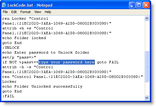
Open the file in Notepad. Replace "type your password here" in the LockCode.bat file with the password you want to use to lock and unlock the protected files and folders. DO NOT forget this password. Save the file as LockCode.bat.
NOTE: We realize this seems unsecure to enter your password in plain text into a text file, but this will be discussed later.
Text of LockCode.bat file
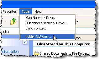
You should now have two files: LockCode.txt and LockCode.bat. If you cannot tell which file is which because the file extensions are not displaying, select Folder Options from the Tools menu in either My Computer or Windows Explorer.
Selecting Folder Options from the Tools menu
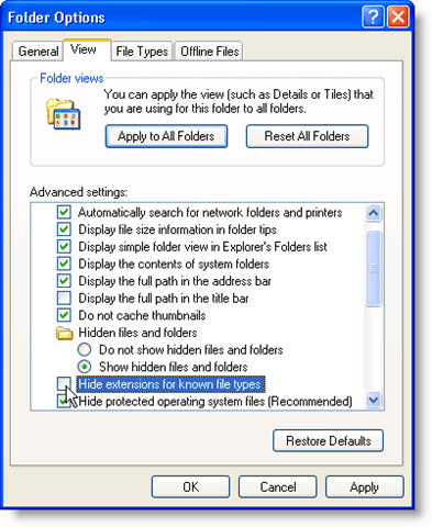
On the Folder Options dialog box, click the View tab, scroll down to the Hide extensions for known file types option and uncheck the check box.
Showing extensions for known file types
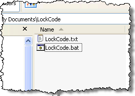
Now you should be able to see the extensions for both files.
File extensions on the files
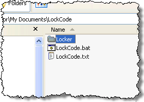
Double-click on the LockCode.bat file to create a new folder named Locker. The new folder is created in the same directory as the LockCode.bat file.
Locker folder created
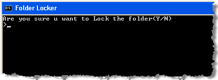
Place any files and other folders you want to protect into this Locker folder. Double-click the LockCode.bat shortcut on the desktop again to lock the Locker folder. You are asked if you are sure if you want to lock the folder. Type a Y if you are sure you want to lock the folder. The folder disappears.
Confirmation of locking the Locker folder
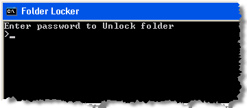
To unlock the Locker folder again, double-click on the LockCode.bat file. You are asked to enter your password.
Enter password
The folder is available again.
To make this a more secure option for locking files and folders, once you have locked the Locker folder, open the LockCode.bat file in Notepad and remove your password. You may either leave it blank or enter a dummy password. Only when you are ready to unlock your files and folders, should you open the LockCode.bat file again and re-enter your password and save the file again.
Then, you can double-click on the LockCode.bat file to unlock the Locker folder. If you don't take this precaution, anyone can open your LockCode.bat file and view your password.
To open a .bat file in Notepad, you must open Notepad first. If you double-click on the file like you would if you were opening a text file, the file runs instead of opens.
Once Notepad is open, select Open from the File menu. Select All Files from the Files of type drop-down list to be able to see the LockCode.bat file. Then, you can click Open to open the file.
Opening a batch file in Notepad
To protect your password, you can also delete the LockCode.bat file and create it again from the original LockCode.txt file when you need to unlock your files.
NOTE: The LockCode.bat file MUST be in the same directory where the Locker folder was created originally for this method of locking files and folders to work. [via Rakshit Khare's Blog]
by Lori Kaufman

May 21, 2014

These Maps Show Every Country’s Most Valuable Exports

Raj J Salecha
shared this article with you from InoReader

Ever wonder what exports ultimately bring in the most money around the world? For many countries, it's obviously oil, but for others, commodities ranging from soybeans to opium to diamonds bring in the most cash.

To visualize this information, GlobalPost gathered data from the CIA Factbook to determine each nation's highest valued export, and then created a series of maps.

See the results broken down by region:

Europe Asia Africa Middle east & Central asia South A   merican North America


InoReader is a light and fast RSS Reader. Follow us on Twitter and Facebook.